Mini-study: Microsoft, Microsoft Support
Client: Microsoft
Project: Microsoft Support Center redesign
Responsibilities: Research & Discovery, Stakeholder Interviews, Competitive & Comparative audit and analysis, Task Flows, Site Architecture, Wireframes, Design direction
Challenges: Microsoft is a large company with many siloed business groups that make sharing customer data difficult resulting in a painful customer support experience
The brief:
SMC team recognized that getting help on Microsoft.com was harder than it had to be due to the siloed nature of individual business units, resulting in one inconsistent experience after another. Additionally, SMC knew customers were forced to spend more time and effort than necessary managing their various accounts–no central location existed where all account information was easily accessible.
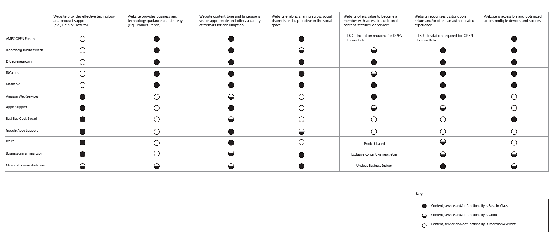
Competitive audit
A competitive audit provides insights into competitor device and/or software service and support offerings as well as brand differentiator awareness.

Competitive audit
Competitor final analysis
Analysis summary provides at a glance how competitors are performing in predetermined key areas of customer service and support.
Competitive summary
Exploring site hierarchy, information display patterns
Sketching is a proven method for successful rapid design iteration where ideas can be easily saved or dismissed before translating to digital versions.

Brainstorm sketches

Brainstorm sketches
Site Architecture, Linking strategies
Both hi-level and more detailed architecture diagrams represent the finalized required depth and breadth of support site sections and corresponding content in addition to appropriate linking strategies.

Hi-level site architecture
Detailed wireframes
Detailed wireframes represent the final information requirements and hierarchy in addition to proposed information patterns to be translated into visual designs.

Wireframe for Desktop breakpoint

Wireframe for mobile web breakpoint

Final designs - mobile device

Final designs - laptop
Results: The resulting redesign focused on the site purpose, removal of unnecessary clutter, simplifying decision trees and process flows, and a redesign of the content itself with a uniform, recognizable visual hierarchy to make the content easier to digest and understand. The site was also redesigned to work across different screen sizes and operating systems, ensuring maximum accessibility for customers.
Last updated: July 2024